Sarah Dayan & The Old Garden of the Alcazar
At the heart of Firewords is our commitment to design. Once the frenzy of a submission period is over, in come our illustrators and artists to do their magic and ensure the whole publication is instantaneously attention-grabbing.
In a new feature, we are going to start looking at design more closely. This series of blogs will allow us to meet some of the creative talent we’ve worked with and find out why they made the design decisions that they (thankfully) did, and how they felt they enhanced the piece of writing they were given.
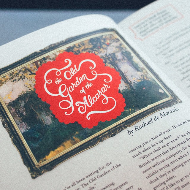
First up is Sarah Dayan, a hand-letterer from France who has so far contributed to Issue 1 and Issue 3 with her amazing lettering skills. In her own words, Sarah takes us through her decision making process as she worked on a lettering piece for the short story ‘The Old Garden of the Alcazar’, by Rachael de Moravia, which can be seen in Issue 3 (you can grab a digital copy from our store.)

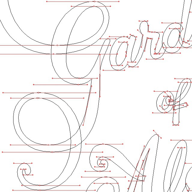
“I was given the short story ‘The Old Garden of the Alcazar’ and it instantly inspired me. The title also appealed to me and got my mind working on how I could visually represent the story with lettering only…
Since this story has a long title, I wanted to give it the appearance of a logo. This avoids the feeling of 'just a handwritten sentence’. The tilted baseline and the fact it’s on several lines also makes it dynamic and eye-catching.
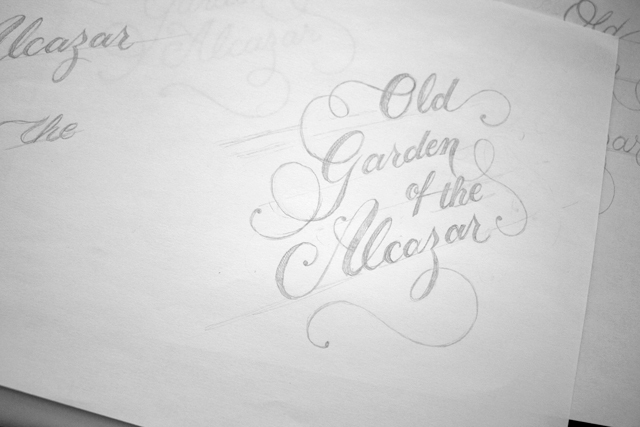
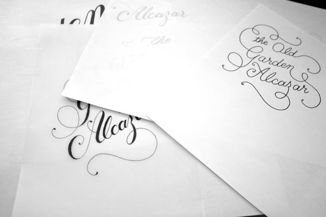
The script style and the presence of lots of swashes and swirls give the piece an artsy, fancy feeling that matches well with the fact that the story is inspired by a real painting by Joaquín Sorolla in 1910. However, I combined this with a 'sticker style’; the bold colours and rounded edge pattern feeling very modern, which contrasts well with the classic impressionist painting.
My chosen lettering style was also influenced by the Chupa Chups logo; the fact that this was designed by Salvador Dali makes it another hidden painting reference.
I chose red because it’s the perfect fit with the painting, which is mostly in a white/yellow/green colour scheme with a few little touches of red.
In my opinion, the whole design matches nicely with what I feel to be the Firewords mood and creative direction; a very visual magazine with bold design. The mix of two artistic movements, impressionism and modern art, brings a cultural richness which, to me, suits the spirit of Firewords.”
Sarah Dayan is a Hand Lettering Artist and Type Designer from France. She makes logos and custom lettering pieces. She loves to turn words into works of art, and enhance their message with the power and beauty of lettering. She also writes about hand lettering and creative business every Sunday on her blog. You can see more of her work on her website and Instagram.